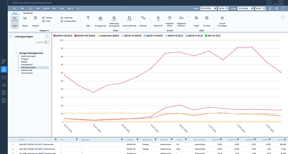
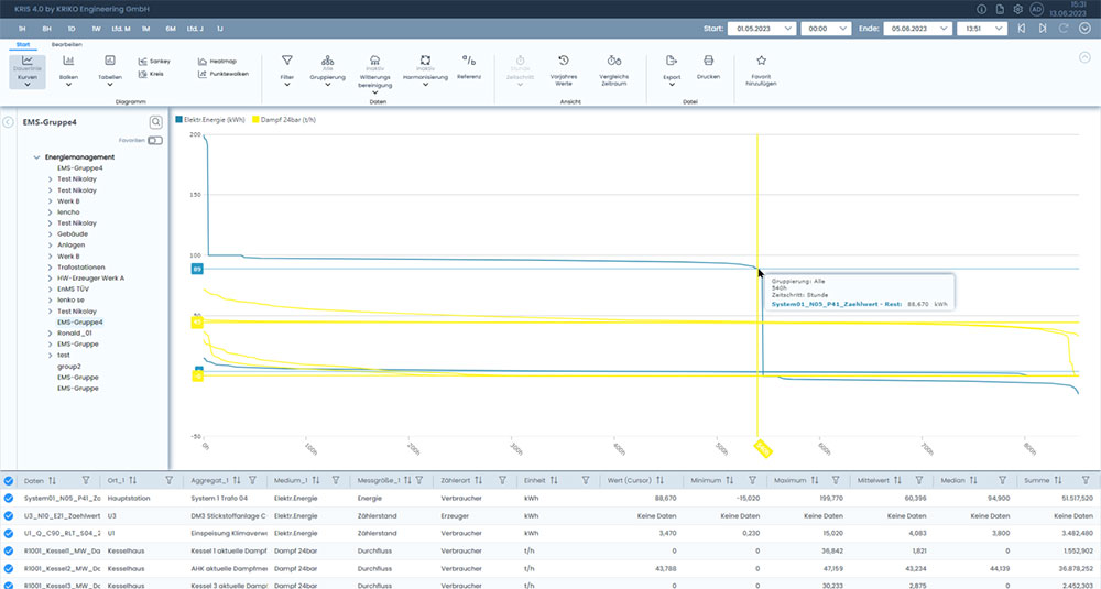
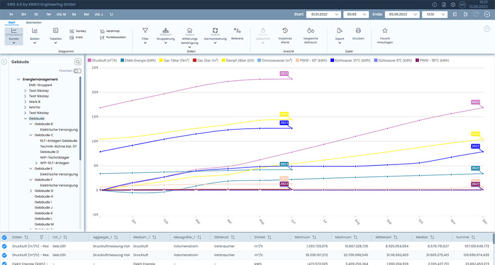
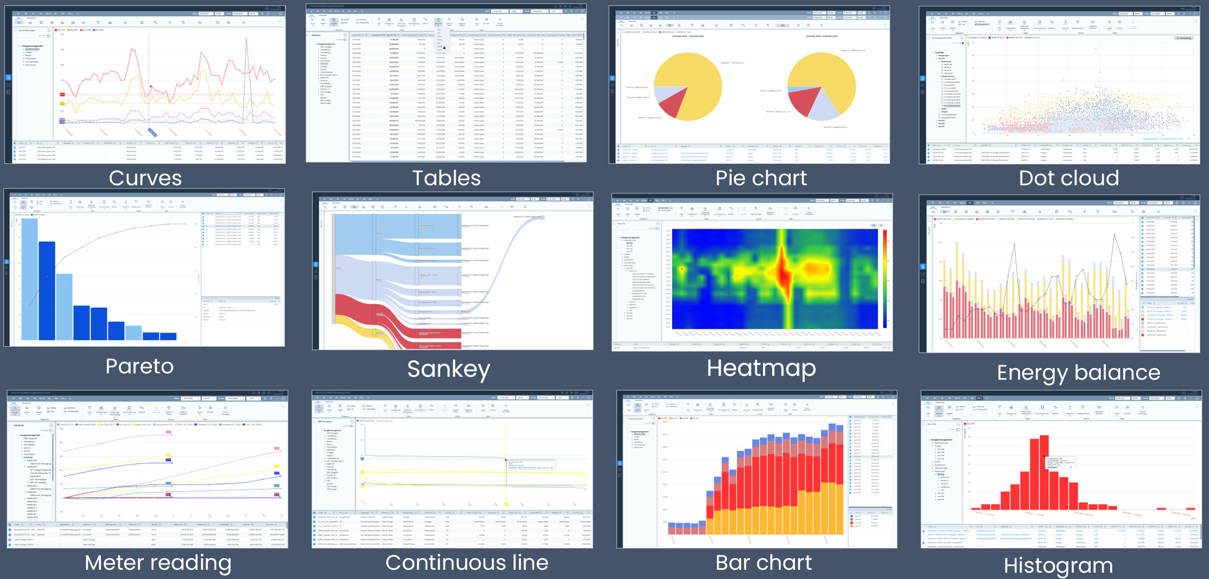
Curves
This chart displays energy consumption of the analysis period as curves. The lines are plotted based on the data grouping—whether “data-point-based,” aggregated by media type, by EMS groups in the tree, or a combination of both. The chart can be freely customized in terms of time period, underlying time intervals, harmonization, filtering, etc.
Your benefit: The curve chart enables an intuitive and detailed analysis of consumption trends over time. This allows you to identify peak loads, consumption trends, and anomalies at a glance—even across different media or locations. Thanks to the flexible configuration, you can specifically examine critical periods, evaluate measures, and make informed decisions regarding energy optimization.
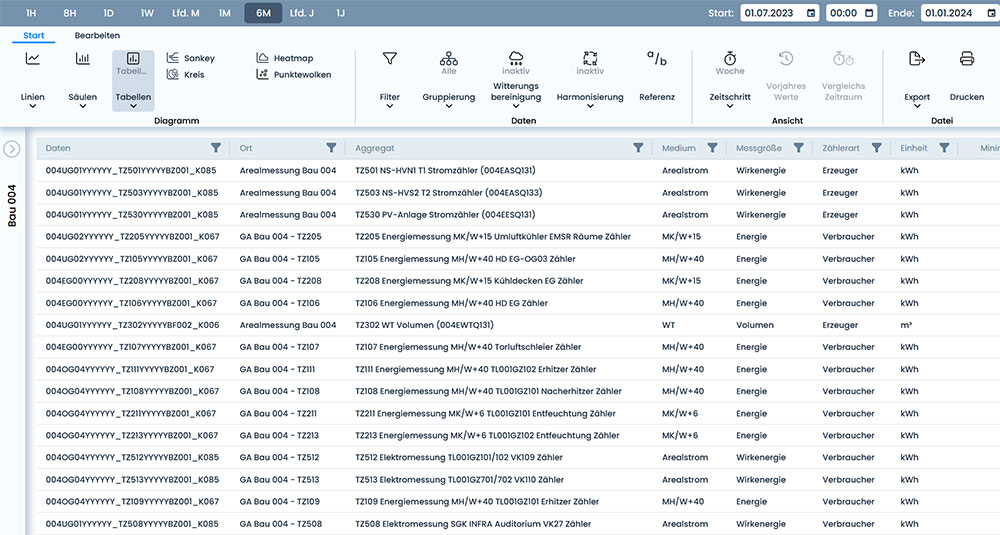
Tables
Tables can be displayed in portrait or landscape orientation. Data groups are displayed by column or by row. When displayed by row, time intervals within the evaluation period can be shown. Data grouping, time intervals, and time periods are fully customizable, making the table highly flexible.
Your benefit: Tables provide a precise and structured overview of energy consumption data—ideal for detailed comparisons, export functions, and further analysis. They enable quick evaluation of key metrics, easy identification of outliers or gaps, and direct processing in Excel or other tools. Tables are an indispensable tool for your data analysis, particularly for audits, reports, or technical evaluations.
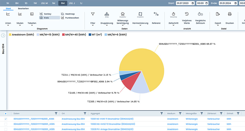
Pie chart
This chart displays energy consumption during the analysis period as pie charts. The pie chart segments vary depending on the data grouping. Thanks to the newly created data grouping options, the chart is a useful tool for identifying the largest energy consumers.
Your benefit: The pie chart provides a quick and visually intuitive overview of the distribution of energy consumption. It helps you immediately identify the largest consumers, set priorities, and derive targeted measures to improve efficiency. Especially when communicating with non-technical stakeholders—such as management or in sustainability reports—the pie chart is an effective way to present complex consumption data in an understandable manner.
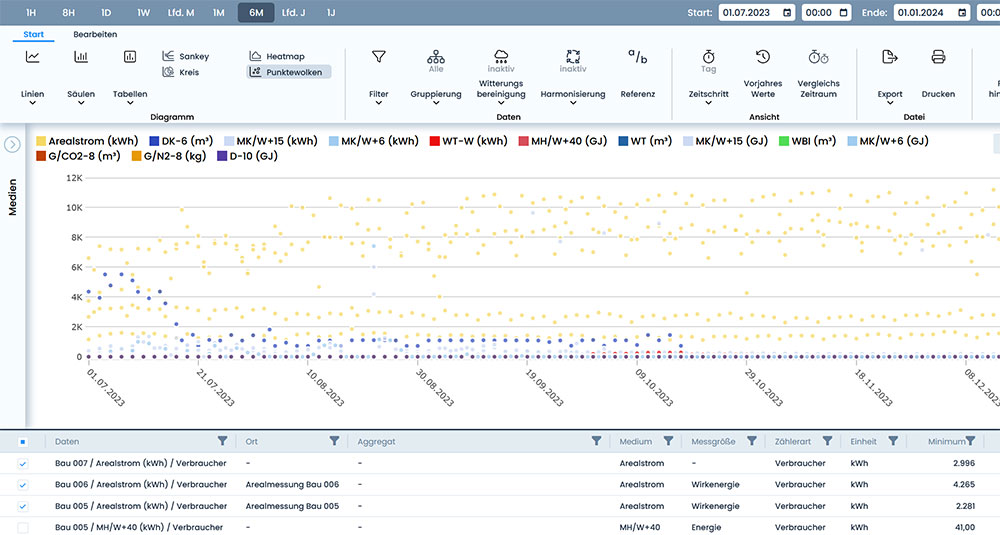
Scatter plot
In this visualization, energy consumption trends are presented over time or as a scatter plot for correlation with other variables. This allows you to identify and visualize correlations and dependencies between specific variables (e.g., outdoor temperature and heating energy demand)
Your benefit: The scatter plot is a powerful tool for identifying patterns and relationships between energy consumption and influencing factors such as weather, production output, or operating hours. It helps you identify the causes of consumption fluctuations, uncover optimization potential, and make data-driven decisions. The scatter plot provides valuable insights, particularly in technical analysis and the development of efficiency strategies.
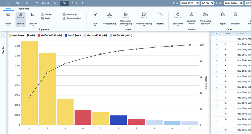
Pareto
This bar chart allows you to identify the largest energy consumers. The data groups shown can be sorted by size. In addition, a Pareto curve is superimposed, showing the share of each data group in the total consumption.
Your benefit: The Pareto chart helps you focus on what matters most: the key consumers with the greatest impact on total energy demand. By combining the sorted bar chart with the Pareto curve, you can immediately see which few consumers are responsible for the majority of energy consumption—an ideal basis for prioritizing actions, reducing costs, and increasing efficiency. The Pareto chart is a particularly valuable tool in strategic analyses and resource planning.
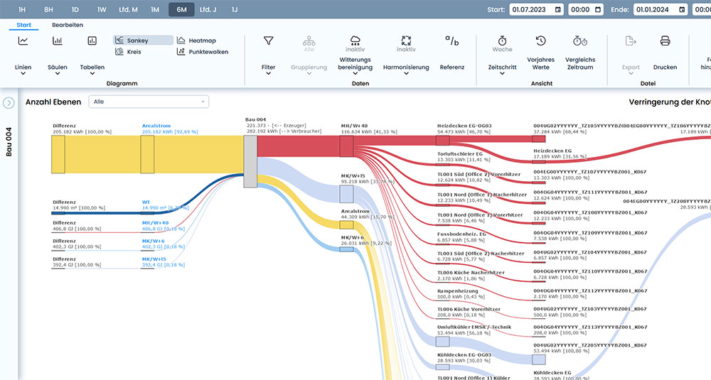
Sankey
The Sankey diagram shows the flow of quantities between individual objects. It illustrates the structures of energy flows within a plant or building. A freely configurable energy tree is available. The diagram is generated automatically with a single click. It is an important tool for identifying inefficiencies and potential savings in the use of resources.
New feature: Generated energy comes from the left, consumed energy goes to the right. This helps with detailed analysis of energy flows. Scenarios such as generation on shared busbars or steam generation on a shared beam can also be displayed.
Your benefit: The Sankey diagram offers a visually striking and easy-to-understand representation of complex energy flows. It shows at a glance where energy is generated, distributed, and consumed—and where losses occur. This allows you to quickly identify inefficiencies, derive optimization potential, and plan targeted resource-saving measures. The Sankey diagram is an indispensable tool, particularly for analyzing plant structures, communicating with stakeholders, or preparing energy audits.
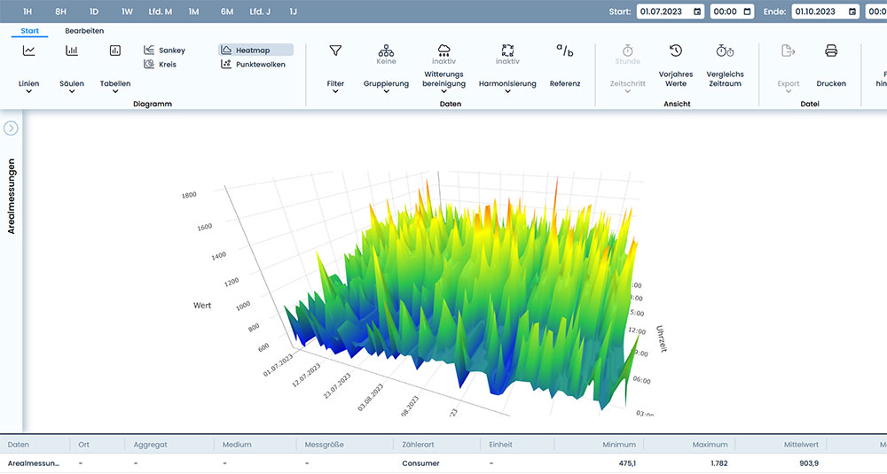
Heatmap
The heat map shows energy consumption over the course of a day. The daily patterns for an entire year can be analyzed at a glance. This allows consumption patterns to be derived and unusual measurements (outliers) to be identified. The Y-axis shows the time of day (0-24 hours), while the X-axis shows the set evaluation period. The hourly consumption values for each day are plotted as Z values in color within the diagram. The color gradient ranges from green (minimum) to red (maximum). You can switch between a 2D and 3D display.
Your benefit: The heatmap provides a quick visual overview of consumption patterns over time—ideal for identifying recurring load profiles, atypical consumption peaks, or inefficient operating times. It helps you analyze consumption behavior throughout the year, identify outliers early on, and implement targeted optimization measures. The visualization is particularly helpful for energy managers who want to compare operating times with consumption data or implement automated anomaly detection.
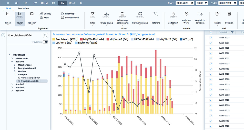
Energy balance
The energy balance compares the energy generated and consumed. This allows the efficiency rate and energy efficiency to be calculated. For example: boiler efficiency, heat exchanger efficiency, COP or EER values of refrigerators/heat pumps. This is a very interesting tool for converters in the energy sector. You see a bar formation consisting of two bars (energy generated on the left, energy consumed on the right) and a balance point for each time step or batch. The balance curve over time shows the efficiency. The display can be freely parameterized in terms of time period, time step, grouping, filtering, etc.
Your benefit: The energy balance display provides a clear and easy-to-understand visualization of the energy efficiency of your systems and processes. It allows you to calculate efficiency levels transparently, identify losses, and implement targeted optimization measures. This tool is a valuable resource—especially for technical plant operators, energy managers, and engineers—for evaluating energy conversion processes and improving overall plant efficiency.
Continuous line
Continuous lines identify the duration and height of load peaks. They display values sorted by size and duration. The shortest durations of energy consumption are shown on the far left of the X-axis, and the longest on the far right. This means that the base load of a data group can be seen on the far right, and the peaks on the far left. The curve provides information about consumption patterns. The flatter the curve, the better the distribution. The duration line is used to identify potential savings.
Your benefit: The continuous line provides a precise analysis of consumption patterns and helps identify and assess peak loads. It shows how frequently and for how long high energy consumption occurs, and whether the base load can be optimized. This enables the development of load management strategies, the reduction of peak load costs, and targeted improvements in energy efficiency. The continuous line is a valuable tool for optimizing energy use, particularly for businesses with variable production or complex load profiles.
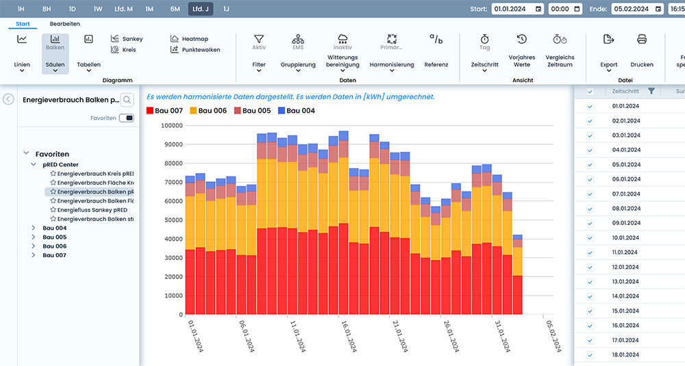
Bar chart
In the freely configurable bar chart, the number of bars corresponds to the display time steps within the display period. The time steps can be easily changed to daily, monthly, or yearly data.The bars are divided into subordinate stack areas based on the data grouping. This makes it easy to compare time periods.
Your benefit: The bar chart provides a clear and structured representation of energy consumption over defined time periods. By grouping data by category, patterns and changes in consumption behavior can be immediately identified. It is particularly well-suited for comparing different time periods, such as for evaluating measures, identifying seasonal fluctuations, or illustrating consumption trends in reporting. Its flexible configuration makes it a versatile tool for operational and strategic analyses.
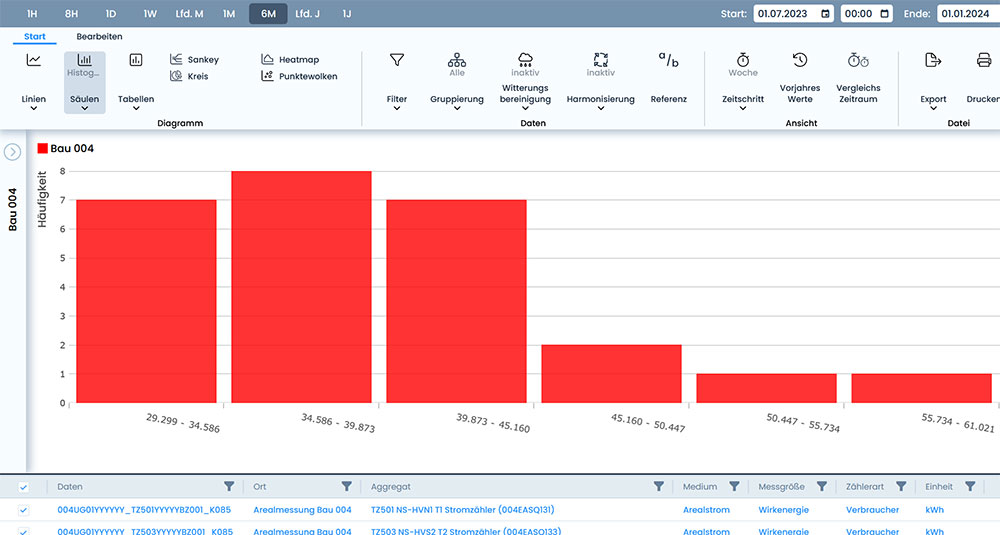
Histogram
The histogram shows the statistical distribution of measured values. An algorithm is used to form so-called measured value classes, which are displayed on the X-axis.The Y-axis shows how often measured values occurred within the class during the evaluation period.
Your benefit: The histogram allows for a quick assessment of the frequency and distribution of consumption values. It helps identify typical value ranges, detect outliers, and evaluate the stability of processes. Particularly in quality assurance, in the analysis of operating conditions, or in the preparation of statistical evaluations, the histogram provides valuable insights into the reliability and efficiency of your energy processes.
Meter reading
The meter reading diagram allows you to compare consumption and generation data, as well as their trends over time, across different years. The total balance of all subordinate generators/consumers is displayed as a continuously rising line for each year.The X-axis in the meter reading diagram covers a whole year (365 days), while the energy data is plotted on the Y-axis. The starting point of the bottom line is the beginning of the display period, from which it continues to rise until December 31 (or the end of the display period).
Your benefit: The meter reading chart provides a clear overview of cumulative energy consumption trends throughout the year. It allows for a direct comparison of annual trends, for example, to assess improvements in efficiency, seasonal influences, or changes in consumption patterns. This visualization is particularly useful for long-term analyses, annual reports, and the evaluation of power generation facilities, as it highlights trends and developments over several years.

![[Translate to English:] Energiemanagement Harmonisierung](/fileadmin/bilder/KRIS/Tools/Energiemanagement-Harmonisierung.jpg "[Translate to English:] Energiemanagement Harmonisierung")

![[Translate to English:] Daniel Siebrecht](/fileadmin/bilder/mitarbeiter/Siebrecht_Daniel_L.jpg "[Translate to English:] Daniel Siebrecht")
![[Translate to English:] Oliver Nann](/fileadmin/bilder/mitarbeiter/Nann_Oliver_L.jpg "[Translate to English:] Oliver Nann")


